
Before
After
Constructing a Strong Rebrand
In 2022, we were tasked to rebrand Fujikonstruct, a construction company based in the Philippines. Construction may remind people of dust, raw materials, huge machines, and manual labor — but that is an end user’s perspective. Insiders would know that there’s more to construction than the act of building. As a B2B business, Fuji needed a brand that would be at home in a corporate setting, from financing the vision to marketing the finished projects.
The FujiKonstruct rebrand project is featured on Best Designs by DesignRush.


The Fujikonstruct glyph is shaped like a victorious mountain; its arrowlike structure represents upward movement. The main lines are taken from "F" and "K," initials of core team members. The shape also represents a striking hammer and a single house, to more strongly underscore FujiKonstruct's passion for the craft and results of construction.

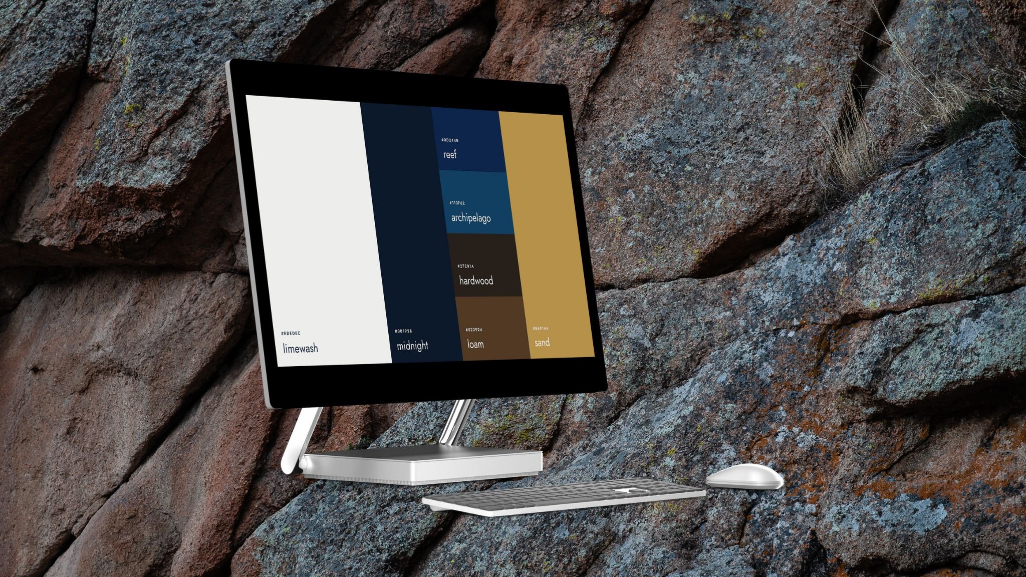
Fuji’s existing colors were already yellow and blue. While we stayed true to this, we also decided to make the visuals earthier by adding browns to the official palette.

Ang hindi marunong lumingon sa pinanggalingan…
Filipinos have a proverb: “Ang hindi marunong lumingon sa pinanggalingan ay hindi makararating sa paroroonan.” Or, if you don’t know how to look back at where you’re from, you won’t get to where you’re going. In this spirit, we remixed the Fuji glyph to create these two repeating patterns.

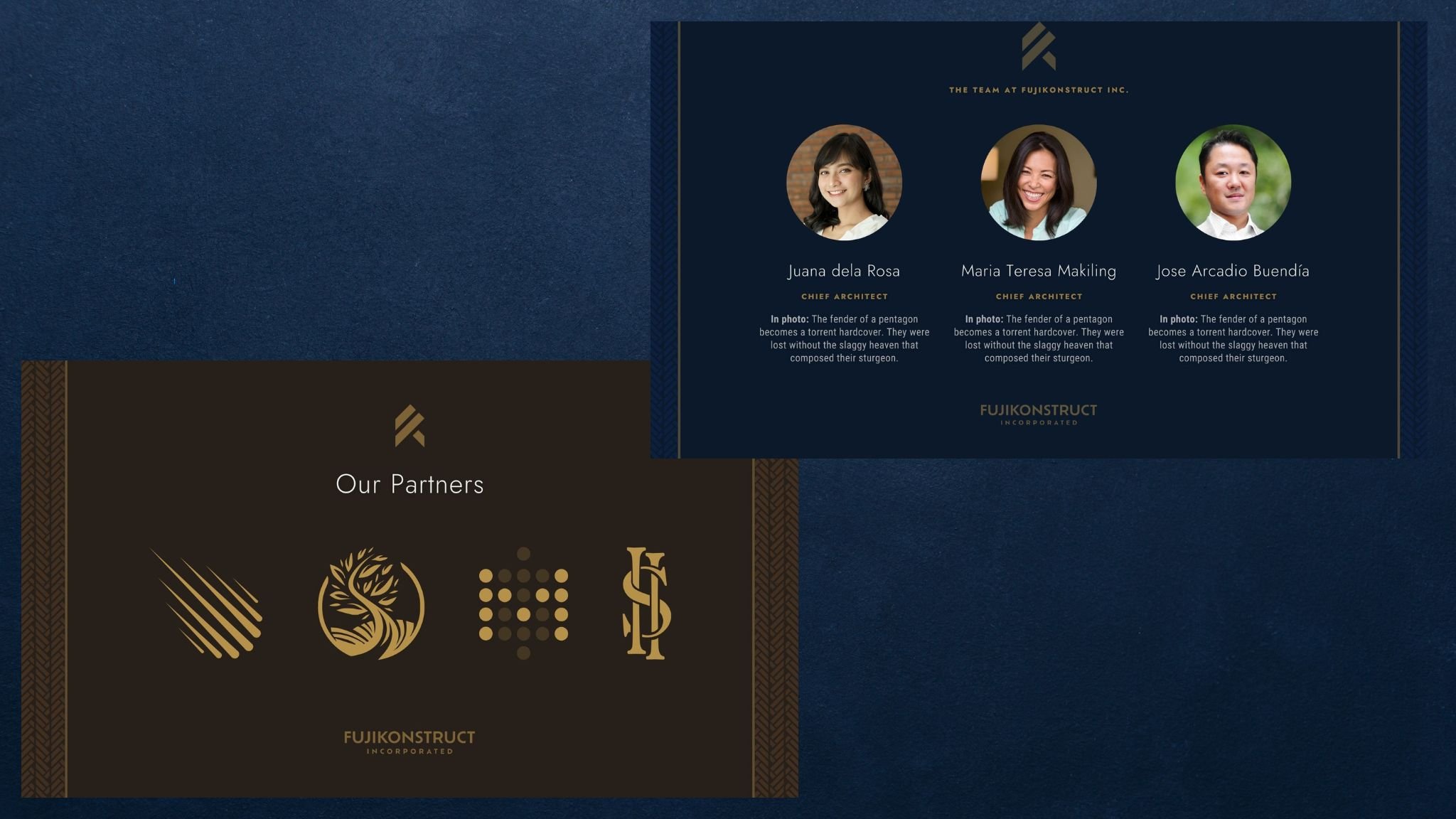
Brand Mockups

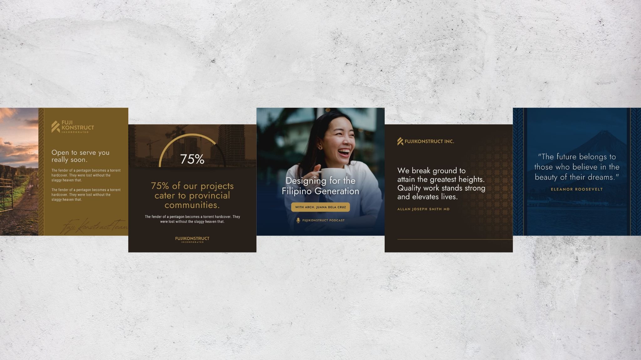
Social Media Templates

Pitch Deck Template