


Branding, art, and packaging for a modern herbal apothecary.
Commissioned by Rene Rodrigo, Herbalist (Association of Naturopathic Practitioners, UK), Oh, Holiday! is both a new brand and a rebrand. Its products and services have been around since 2016, but in 2021, everything was consolidated under a single brand with the burstingly joyful name "Oh, Holiday!"

We started at home: Baliwag Imbuté
Oh, Holiday’s patterns were delightful to work on. The designs below are based on imbuté, a carabao bone inlay technique from Baliwag, Bulacan. A few decades ago, it was very popular to have one's heavy wooden furniture decorated this way. In the 90s, it was just the kind of stuffy old furniture your grandparents would have. But time is kind to beautiful things, and today, many Baliwag imbuté pieces are considered rather valuable antiques.

When Rene called me about branding Oh, Holiday, the imbuté motif was one of the first things I suggested. We have a beautiful, dark narra sala set at home, inherited from my husband’s grandparents, that I’d been dying to use as a muse for a creative project, and Rene herself has a penchant for beautiful mid-century pieces.
Objectively speaking, though, the imbuté motif is a whole mood, whether you know the history or not. If you do, it’s a lovely local throwback; if you don't, it still has that colonial mid-century vibe. A win-win.


“So… the Grand Budapest Hotel, but make it Asian?”
That’s pretty much how the first virtual meeting for this went. I know it’s much easier to say “chinoiserie,” (or is it?) but it was a lot more fun, and very visually stimulating, to keep thinking The-Grand-Budapest-but-make-it-Asian. With this odd but simple premise in mind, I built the brand’s small collection of illustrations and elements before working on patterns, patterns, and more patterns.


Brand Illustrations
The original cat illustration was created by Adrian Panadero for Kana Oriental, the former brand name of Oh Holiday's skincare products. Upon the client's request, I populated the branding with other creatures using a similar illustration style.
To get a feel of the original texture used, I started by “blowing up” the image of the rose that the cat is holding. Then I proceeded with the other flora and fauna, each a special request of our herbalist Rene.
The snake is an ancient Greek medical symbol, while the red cardinal is also a spiritual icon. The yellow tulip is especially meaningful — it's a colorized version of a pencil drawing done by the client's husband.

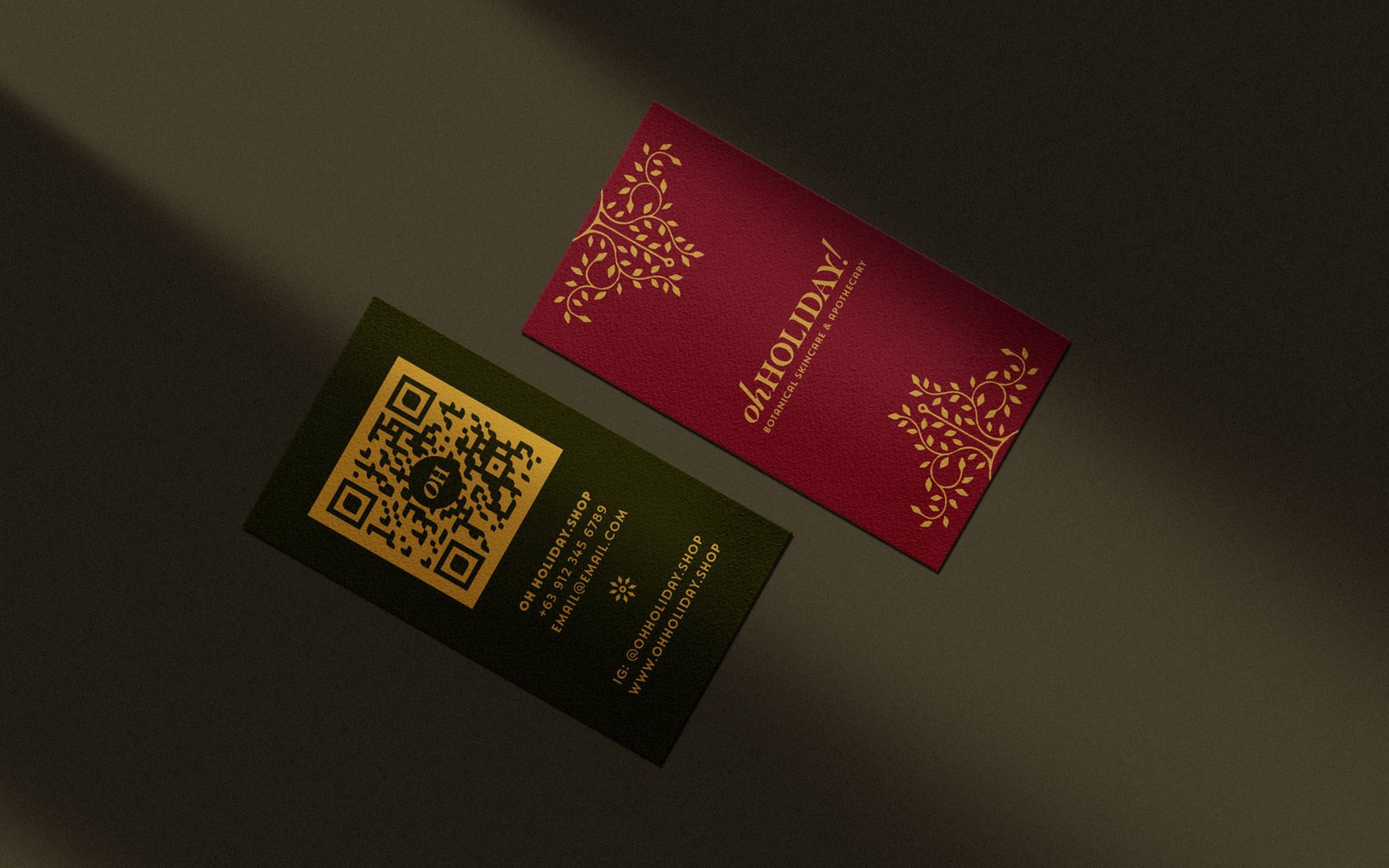
Warm, eclectic, holiday-making brand colors.
In branding, such as in painting or photography, it’s a good discipline to determine your lowest and highest values. Oh, Holiday’s darkest and lightest colors, then, are not black and white, but Trench, an ocean-under-midnight blue, and Pointe, a satiny, slightly dusty, ballet-shoe cream.
Moss is an alternate dark hue, and together with fresh-foraged Berry and golden mustard Dijon, it’s responsible for the brand’s low-key year-round Christmas feel. Stone, Orchid, Celadon, and Hollyhock are soft pastels that are strongly reminiscent of French Chinoiserie.
Brand typography built with 20th-century oldies-but-goodies.
Created in 1937, you’ve definitely seen curvy, ribbony Coronet around a lot. Masqualero is type designer Jim Ford’s tribute to jazz legend Miles Davis. I chose it, in part, for its ecstatic rendition of the letter Y. A combination of Masqualero and Coronet is used in Oh, Holiday’s logo.
“[Masqualero] dresses up words. It’s the black tuxedo or stiletto heel.”
— Jim Ford, creator of Masqualero
Typewritten Coronette is rough but refreshing and easy on the eyes, while Natom Pro is an interestingly rounded geometric sans serif great for labels and tiny text.


All official brand fonts are available in the Adobe Typekit, except for the accent font, Coronet. This is why Oh, Holiday has alternate free font sets from Google Fonts and Canva, so the in-house team can still create graphics on their own without compromising the brand look.

Creating social media templates in Oh, Holiday’s Canva account
With branding and packaging out of the way, it was time to create social media post templates. I built these templates within Oh, Holiday’s company Canva Pro account, uploading the brand’s many graphic elements.

Hosting branding and social media design tutorials for the in-house team
Rene and her team manage their social media in-house. It’s a vital part of their operations; they interact with many of their customers (including myself) on channels like Instagram. So we set up two one-hour sessions with Oh, Holiday’s social media manager so that they could maximize the brand’s custom templates and get familiar with the brand’s color and typography rules.

Wrapping it up…
Oh, Holiday’s packaging is at the heart of all its design activities. We ensured that each label, whether minimal or flamboyant and regardless of the printing and production limitations, is at home in the overall branding.


Oh, Holiday! is in Powerplant Mall.
As of this summer (2022), Oh, Holiday! is a real, physical pop-up store in Rockwell. Watch this video by Mao del Rosario, where Rene documents her preparation. (And cue music: “Let’s Go to the Mall” from HIMYM.)
You can check out Oh, Holiday’s online shop or go to Rene Rodrigo’s journal, where she writes about herbs, motherhood, health, and more.
