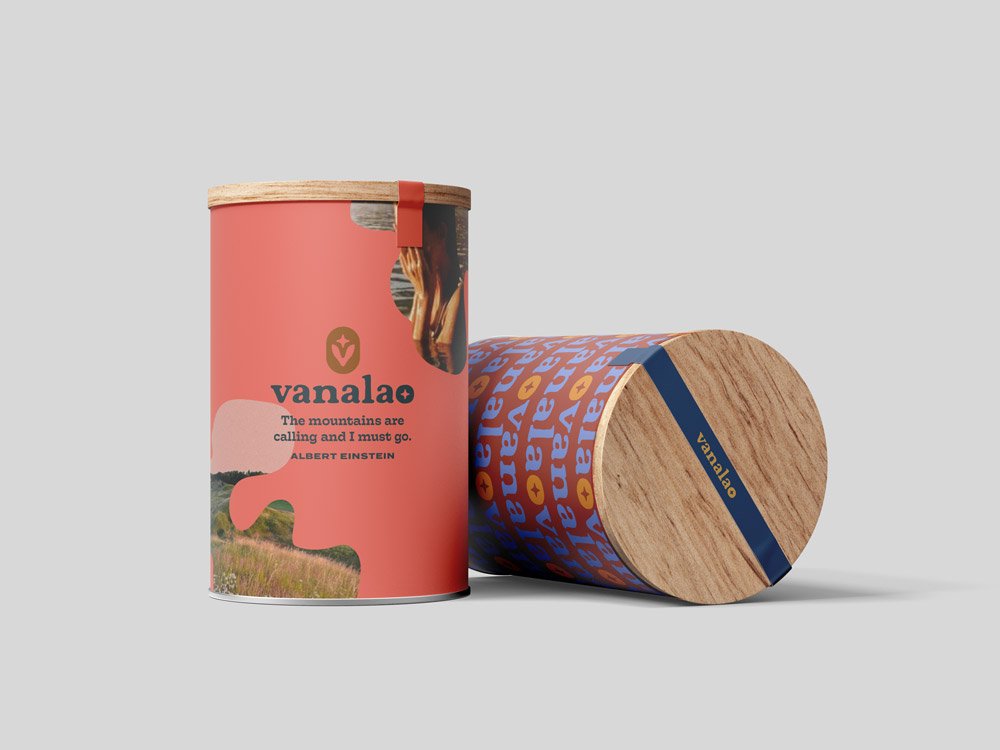
Full branding for Vanalao, an eco-conscious European scented candle brand.

Vanalao went through a comprehensive, but very smooth, moodboarding process.
The client’s initial brief was quite detailed, including a good selection of brands that inspired them as well as notes about their own initiative. Every meeting and moldboard presentation we had immediately led to much more clarity, with almost no setbacks at all. Vanalao was a textbook example of just how important good communication is at the start of every branding project.


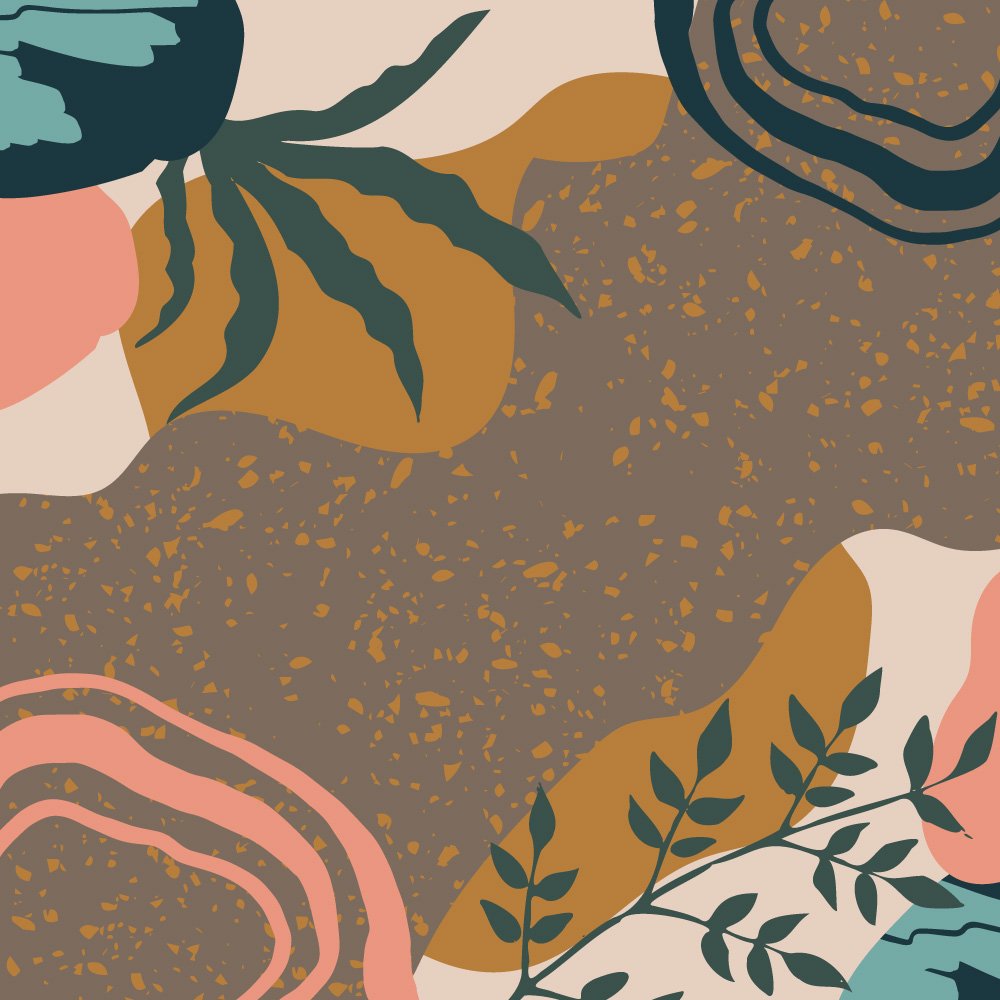
Fun studies that didn’t make the cut!
Above and below are examples of studies that didn’t make the cut. I don’t often post too many studies, but for Vanalao, we really made time to explore very different creative choices to see what would align with their final vision.
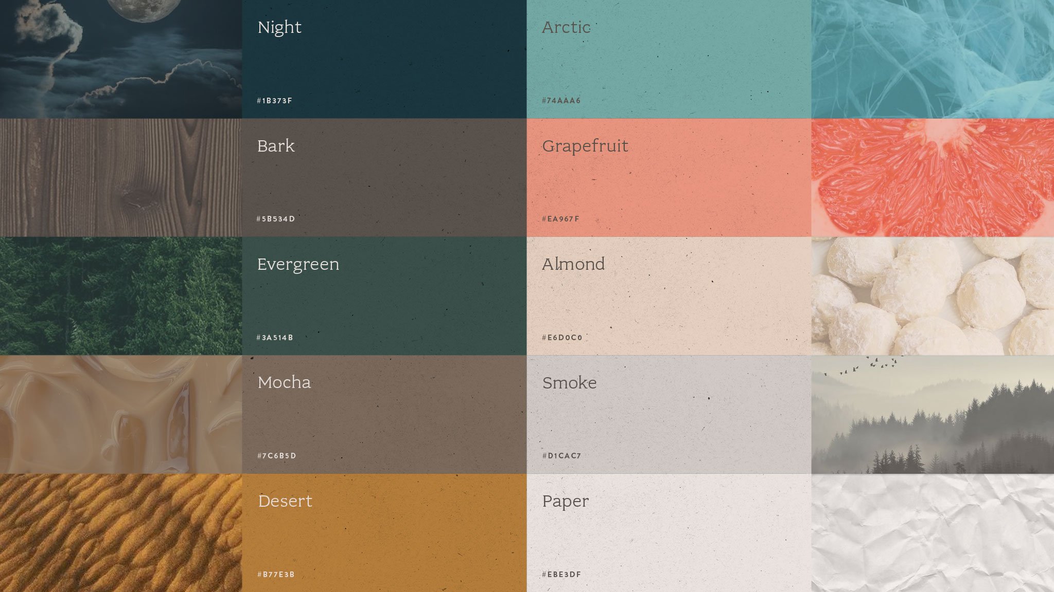
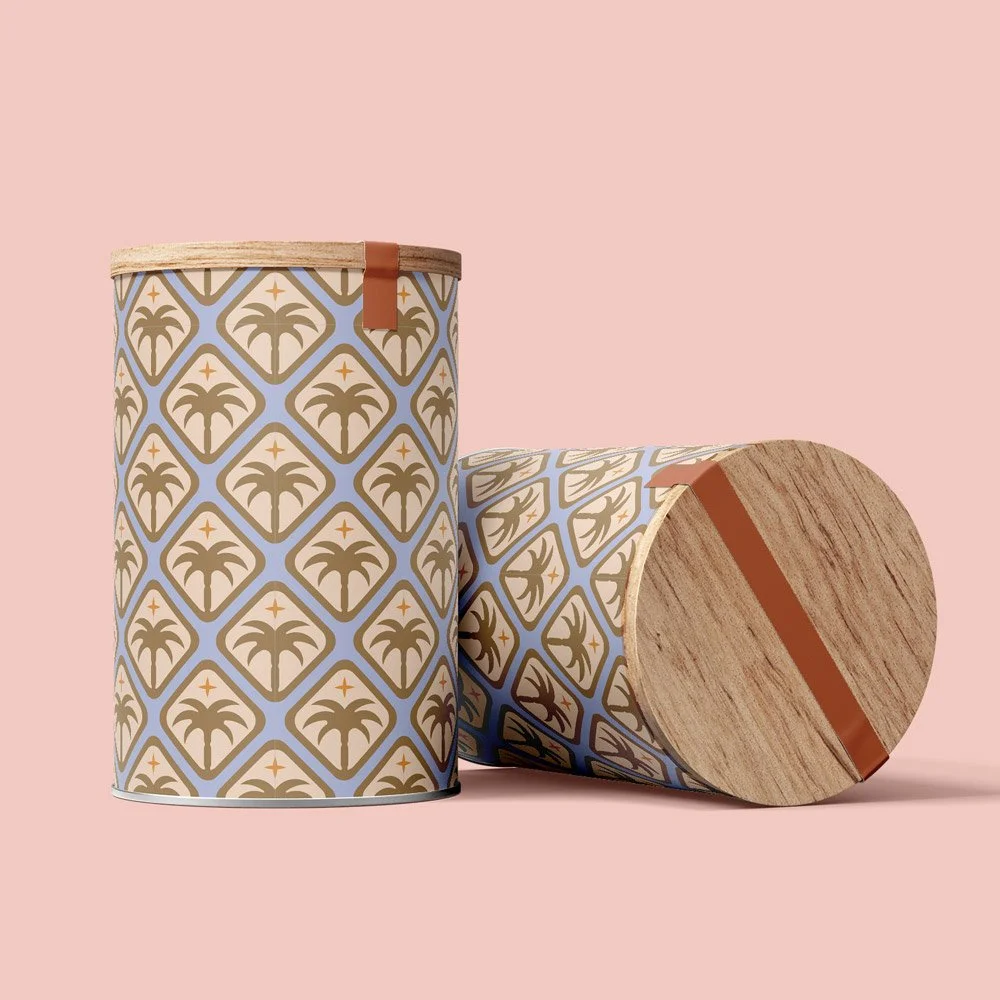
So these look very different from the final result. They were made near the beginning of the project when we were still playing with very fruity, summery colors. In the end, we would settle for quieter earth tones, to better capture the brand’s target personas who leaned toward mature, independent, and outdoorsy personalities.


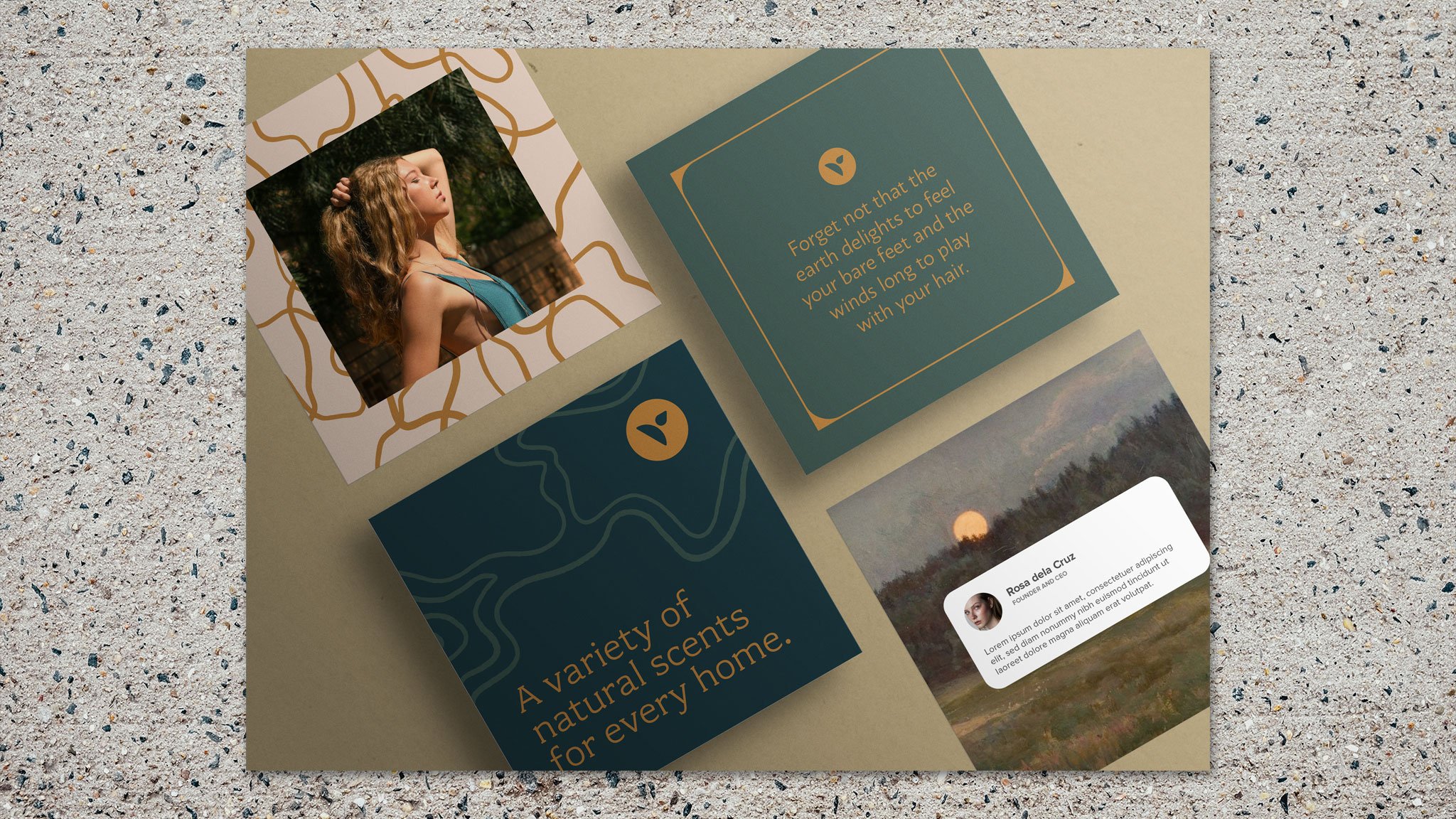
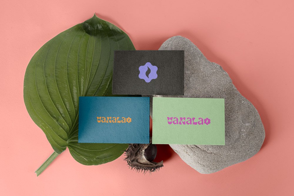
Vanalao’s final brand look is at home in nature.
During the mood board and study creation parts of the process, we explored hot-girl-summer colors and fun funky patterns… Then we got lost in the forest, and stayed there.
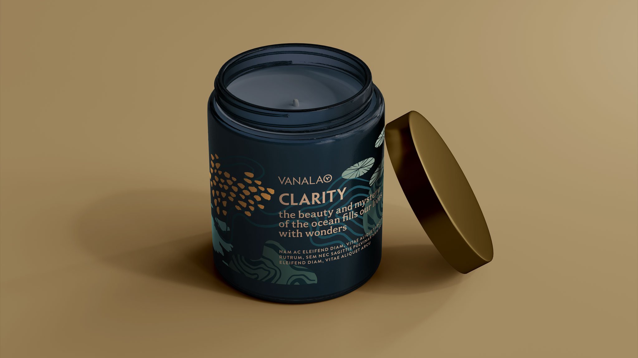
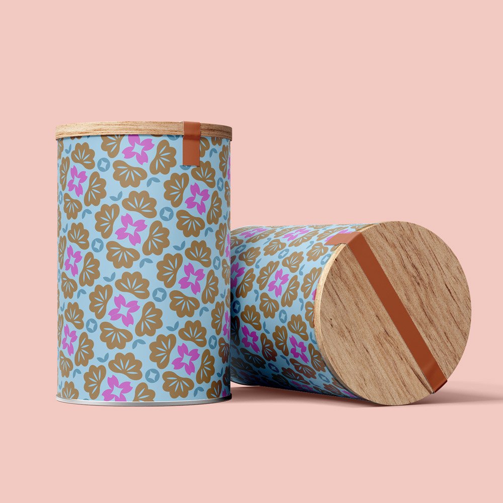
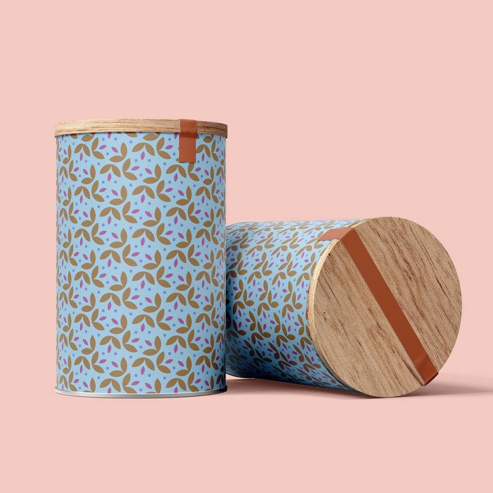
Vanalao settled on calming, organic, and understated, with a common motif that uses different colors and elements for each of the three initial product offerings: Vision, Clarity, and Habitat.
-
Vision: Sunlight-Themed

-
Clarity: Ocean-Themed

-
Habitat: Forest-Themed
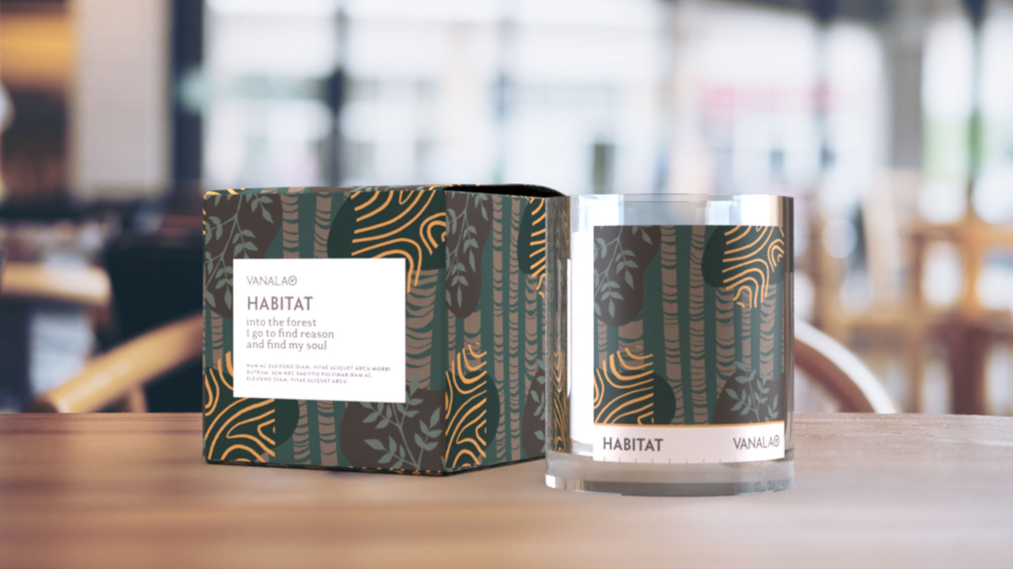
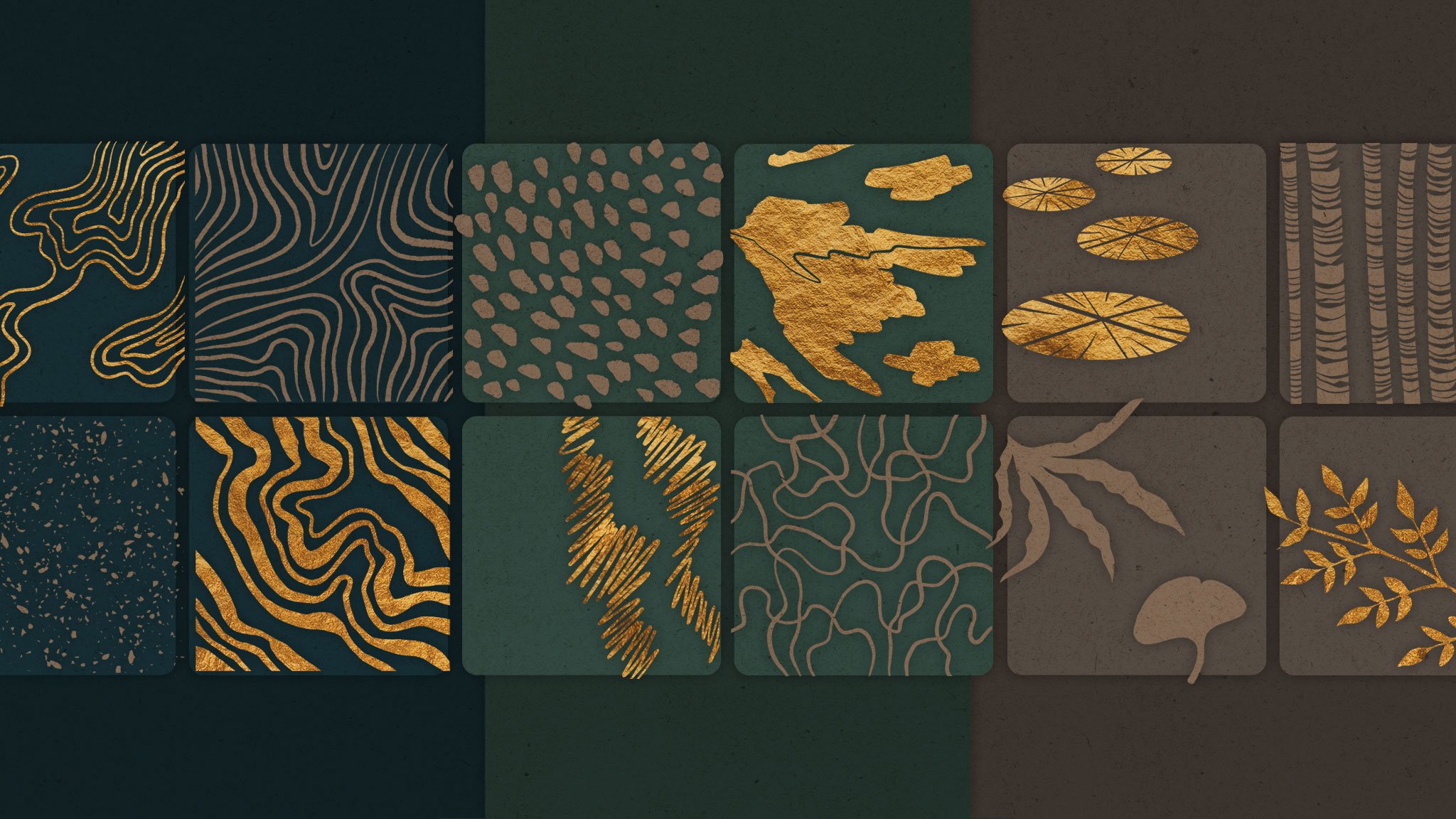
Custom organic elements for each product line.
The client requested minimal, abstract illustrations, which I sketched in pencil first and then finalized in Procreate for a hand-drawn effect. It’s okay to mix, match, and swap elements, but each product line has its own distinct colorway.


Understated, nature-inspired brand colors.