
Kasa Mama: Babywearing Ring Slings
Kasa Mama is an amalgamation of three different words: “Kasa,” like the Spanish casa or home; obviously “Mama” for mother; and the implied “kasama,” which means companion. Though the brand and its products have now been absorbed into Oh, Holiday!, I thought to include this case study because it was such a synergistic creative exercise, by women, for women.


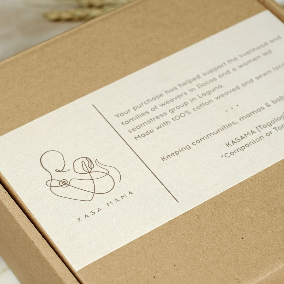
The world has countless by-women-for-women projects, but this one, in particular, tugged on all our heartstrings because of its closeness to home. The slings are created by weavers from Ilocos and women-led sewing groups in Laguna. There’s no one better: babywearing is an ancient practice that our highland neighbors never really lost. The biggest and most modern twist is, for me, in the custom colors, as soft as morning sunlight through nursery curtains.
Kasa Mama was a project of sisters (and then new mothers) Rene and Riva. Rene’s vision for the logo was a single-stroke drawing, in which I also included the faintest hint of an ampersand-like shape.


The brand fonts are quiet sans serifs (Spinnaker and Proxima Nova Condensed) paired with a handwritten accent font (Tantinotes), as messy and caring as a mother’s signature. The colors palette is called Touch, and was designed to reflect the brand’s mood and its products. Its darkest and lightest tones are Earth and Nursery, a dark gray taupe and a warm white. Blush, Kiss, Coconut, and Cloud are muted and creamy peaches, pinks, and blues, completing the dream-universe that exists when a mother and child are resting skin to skin.


Above are the three proposed color palette options. Tropics features a sunny melon tint, while Safety is more muted and higher in contrast. As you know, we went with Touch, the warmest and coziest palette, which also best mirrors the actual product colors.
Blush, Cream, Copper, and Rose
Finally, the below images for social media use were shot in our home studio.
As Kasa Mama is a product with very subtle, but very specific, colors, our team doubled down on the color-grading process. What you see here is the most accurate representation possible of the beige and blush cloths, and most especially of the copper and rose gold rings.


